Read your results
Viewing a report
Anatomy of a report: live progress graph, valuation summary, charts, and the write-up.
Every analysis opens to a report page that fills in as the pipeline runs and then settles into the finished report. Here's what you're looking at, top to bottom.
The progress graph
While the analysis runs, a progress graph shows each step light up as it starts and finishes. The research steps run side by side; then a plan step decides how to value the company (a single DCF, a segment-driven DCF, a sum of the parts, a dividend model, or a bank FCFE model), and the graph re-forms around the pipeline it chose. A detail rail underneath tracks the sensitivity tests, the quality critique, and the figures as they land. Click any step to open the adaptive pipeline docs at that step and see what it does.
Header and investment thesis
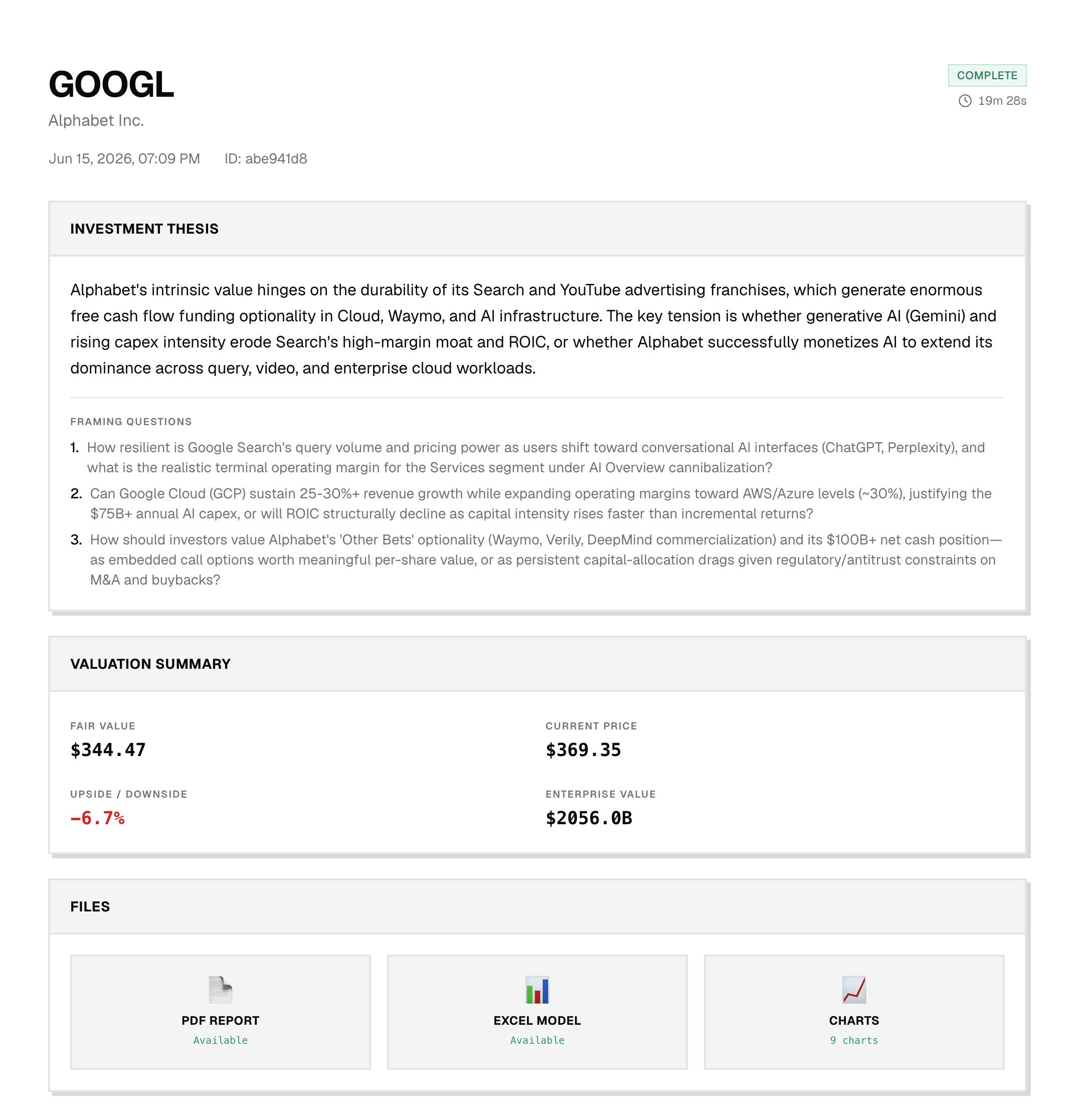
The header shows the ticker, the company name, and your thesis. The thesis card restates your thesis and the framing questions the report set out to answer, so the conclusion always ties back to the question you asked.
Valuation summary
The summary gives dbot's fair-value estimate next to the current market price, so you can see at a glance how the two compare and how big a gap the story has to close.
Charts
The charts show the valuation visually: the valuation bridge, the cash-flow or dividend projection, the peer comparison, and the sensitivity heatmap. These are the same images that go into the PDF.
The write-up
Below the charts is the full report: an opening observation, the valuation thesis, a walk through the numbers, the counter-arguments, and a balanced close with a few things to watch.
When you want to take the report with you, see Downloading PDF, Excel & charts.